
New Dashboard: See Your Job Search Clearly
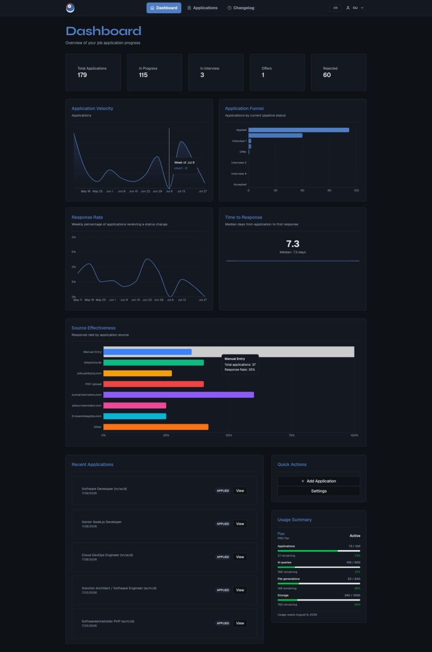
A job search only feels productive when you can see it. Most people run their search on instinct: they remember the last three applications, the last rejection, the one callback last Tuesday. The rest is fog. We rebuilt the myKaria dashboard to make the whole picture visible, so you can spot what's working, what isn't, and what to change next.
A daily tip, just for you
Above the stat cards, you'll now see a small banner with a daily tip — one piece of plain-language advice about your own search, written for you and refreshed every morning. It might call out that your response rate has dropped, suggest a kind of role your funnel converts well to, or flag that you've been sending a lot of applications to a single source. Nothing generic. The tip is generated from your real activity and your real numbers, in the language your account is set to.
It only shows up if you're actively searching — you need at least a few applications on the books and some movement in the last week. If you don't see a tip today, the system is telling you there isn't enough signal yet to write a useful one. It's not a bug.
You can dismiss it whenever you don't want to look at it. Tomorrow's tip is a new one.
Your numbers, at a glance
The top of the dashboard now shows five live counts so you always know where you stand:
- Total applications — everything you have out the door.
- In progress — anything past "Applied" that hasn't ended in a yes or no yet.
- In interview — the count of applications you're currently in any interview round for. This is the new stat card, and it's the one most people underestimate.
- Offers — the number that matters.
- Rejected — so you can see when a wave of rejections hits and adjust.
Five charts that actually answer questions
Below the stat cards, you'll find five charts designed around the questions job seekers ask themselves the most:
- Application velocity — how many applications you're putting out per week, over time. Lets you see the dip after a rejection, the sprint before a deadline, the slow week that turned out to be your most productive one.
- Application funnel — every status from Applied to Accepted, side by side, so you can see how your pipeline actually narrows. Most people are surprised at how thin the bottom of their funnel really is.
- Response rate — what percentage of your applications get any reply at all, week by week. A response rate below 10% usually means your CV or your targeting needs a hard look.
- Time to response — the median number of days from sending an application to hearing anything back. Industry average is around two weeks; if yours is much higher, that's a signal too.
- Source effectiveness — which job sources (your own outreach, job boards, recruiters, referrals) actually convert into responses, and which ones are burning your time.
What to do with the numbers
None of this is useful as decoration. Here's how to actually use the dashboard once it's loaded:
- Start with the funnel. Where is it narrowing the most? That's your bottleneck, and the rest of the dashboard tells you whether to fix it with more applications, better targeting, or a stronger CV.
- Compare velocity to response rate. If your velocity is climbing but response rate is flat or falling, the message isn't that you need to apply more. It's that the applications you're sending aren't landing.
- Check your sources. Source effectiveness will almost always confirm what you suspect: one or two sources do most of the work, and the others are mostly noise. Put your time into the ones that respond.
- Track your plan usage. The Usage Summary on the right shows your monthly plan, applications, AI queries, file generations, and storage. If you're consistently under-using, you can downgrade. If you're constantly hitting the ceiling mid-month, that's a sign your search is at full speed.
What we left out
We deliberately didn't add leaderboards, comparisons to "average users," or any score that pretends to measure how good your search is going. A job search isn't a game. The numbers here are tools for you to read your own situation, not a way to rank it.
Open the dashboard. Look at where you actually are. Then decide what to change.